


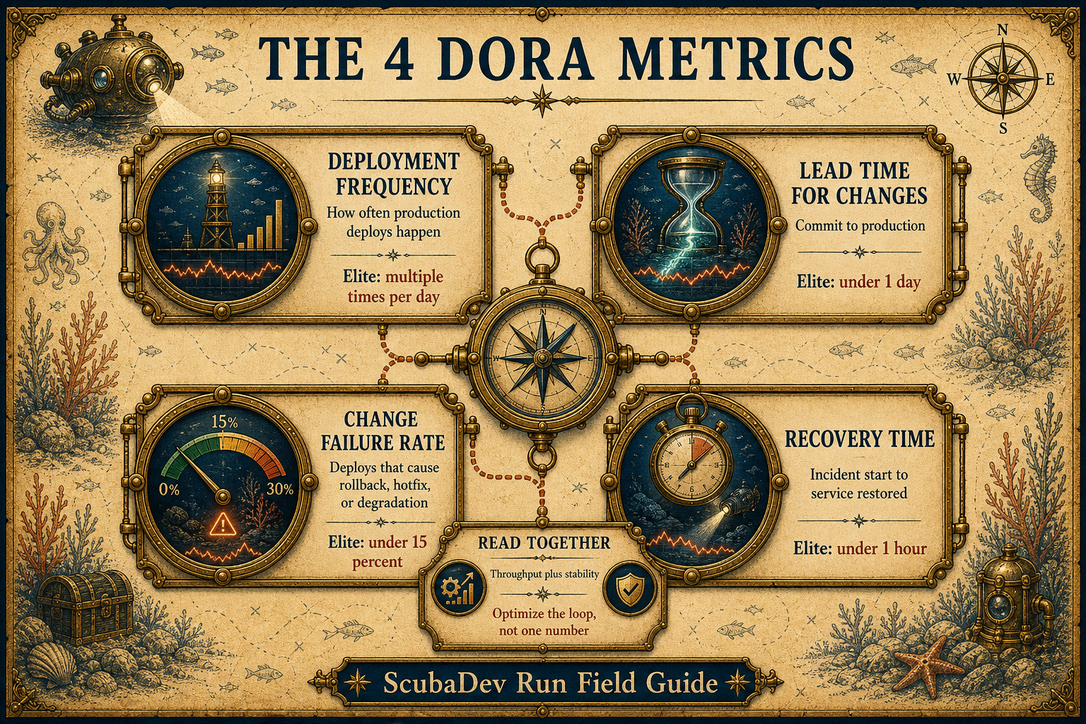
DORA metrics are deployment frequency, lead time for changes, change failure rate, and failed deployment recovery time. Elite targets in 2026 are multiple deploys per day, lead time under one day, change failure rate under 15 percent, and recovery under one hour.
You can measure all four with a webhook, a Postgres table, and a small dashboard. The teams that improve fastest measure first, optimize second, and keep AI-assisted delivery inside the CI and PR loop.
Below the surface
DORA stands for DevOps Research and Assessment. The four metrics matter because they read throughput and stability together instead of rewarding engineering motion that never reaches production.
Two metrics measure speed: deployment frequency and lead time. Two measure resilience: change failure rate and recovery time. Read together, they show whether a team can ship smaller changes, learn quickly, and recover before customers carry the cost.
01 / The four metrics
The operating scorecard
Deployment frequency counts successful production deploys. Lead time measures commit to production. Change failure rate counts deploys that require rollback, hotfix, patch, or cause degradation. Recovery time measures incident start to service restored.
The set works because it blocks local optimization. If speed rises while failure rises, the team is shipping risk. If failure is low while lead time stretches, the team is protecting quality by starving cadence.


By the numbers
Elite targets in 2026
Use these as directional targets, then baseline your own team before chasing the leaderboard.
Deploy frequency
Many/day
Elite teams deploy to production multiple times per day.
Lead time
1day
Elite changes reach production in under one day.
Failure rate
15%
Elite and high performers stay under 15 percent.
Recovery time
1hr
Elite incident recovery is under one hour.


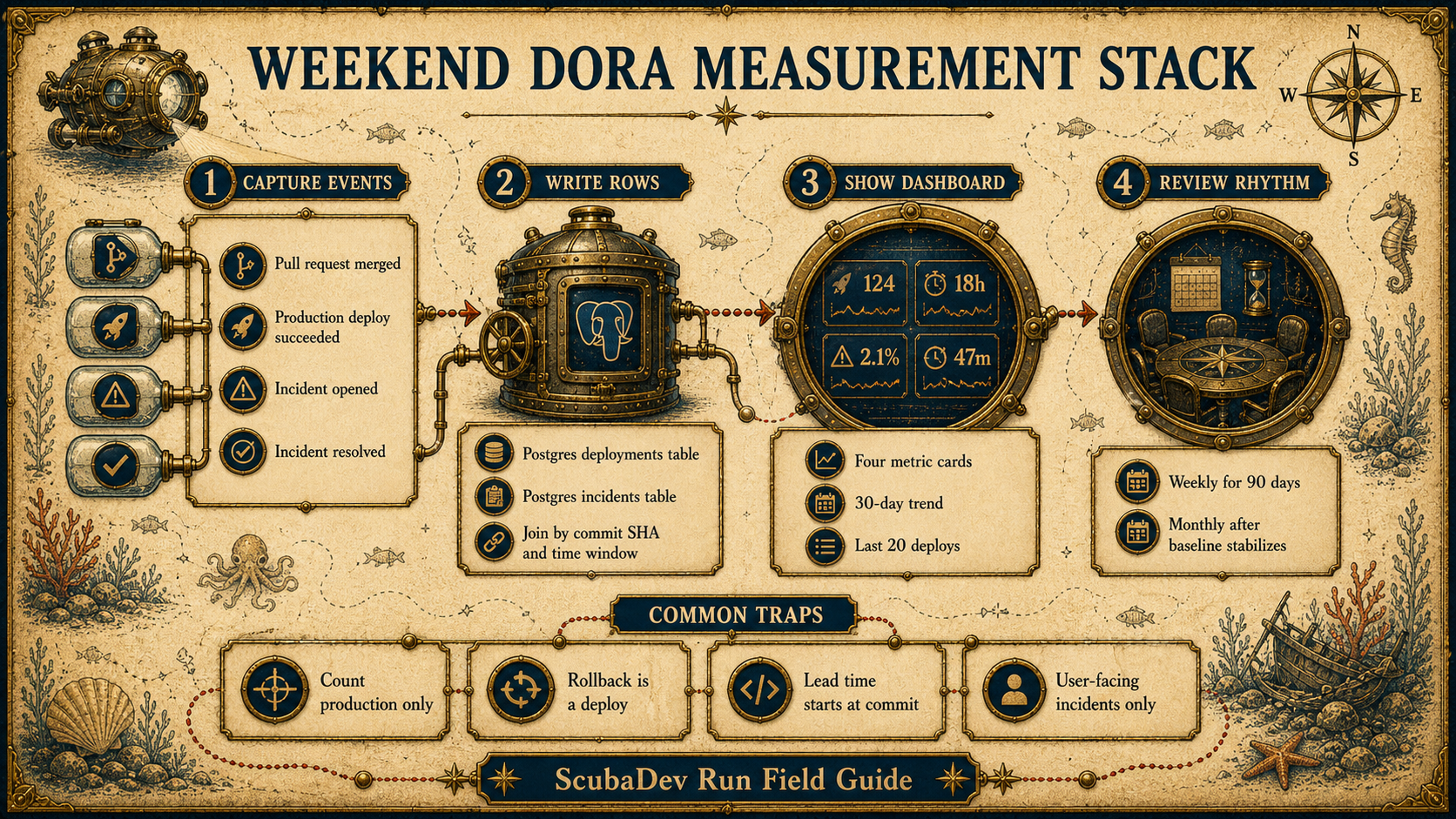
03 / Measurement stack
Measure it without a giant tool
A small team can collect the needed events with GitHub, Linear or PagerDuty, a webhook, and Postgres. The important part is consistent definitions.
Ideas library patterns
Four dashboard patterns that make the metrics actionable
The source post references these idea-library builds as the practical dashboards and narrative layers around the DORA loop.
-
01 / Weekly metrics digest with AI narrative
Key metrics summarized in plain language every Monday. Calls out what moved, what slipped, and why.
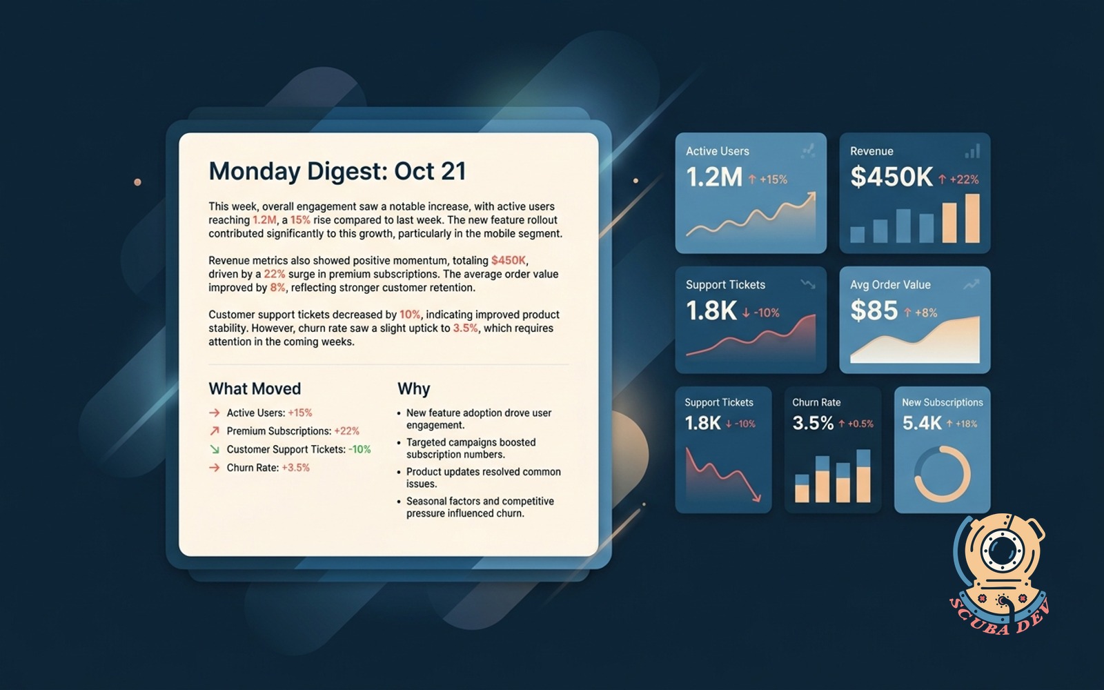
Use this as the narrative layer on top of deployment frequency, lead time, failure rate, and recovery time so the team sees the movement before the dashboard becomes homework.
Read the full idea: Weekly metrics digest with AI narrative →
-
02 / Churn risk dashboard with one-click save plays
Scores accounts weekly using product usage and billing signals. Ships save plays as emails or tasks with a click.
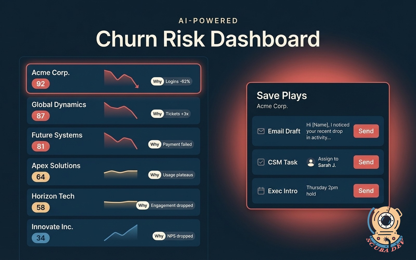
This is the customer-success companion to delivery metrics: the same weekly signal discipline turns product usage, support, and billing movement into action before accounts drift.
Read the full idea: Churn risk dashboard with one-click save plays →
-
03 / Funnel conversion dashboard with drop points
Shows the conversion step by step. Ranks the biggest drop-offs with the session count you would need to move.
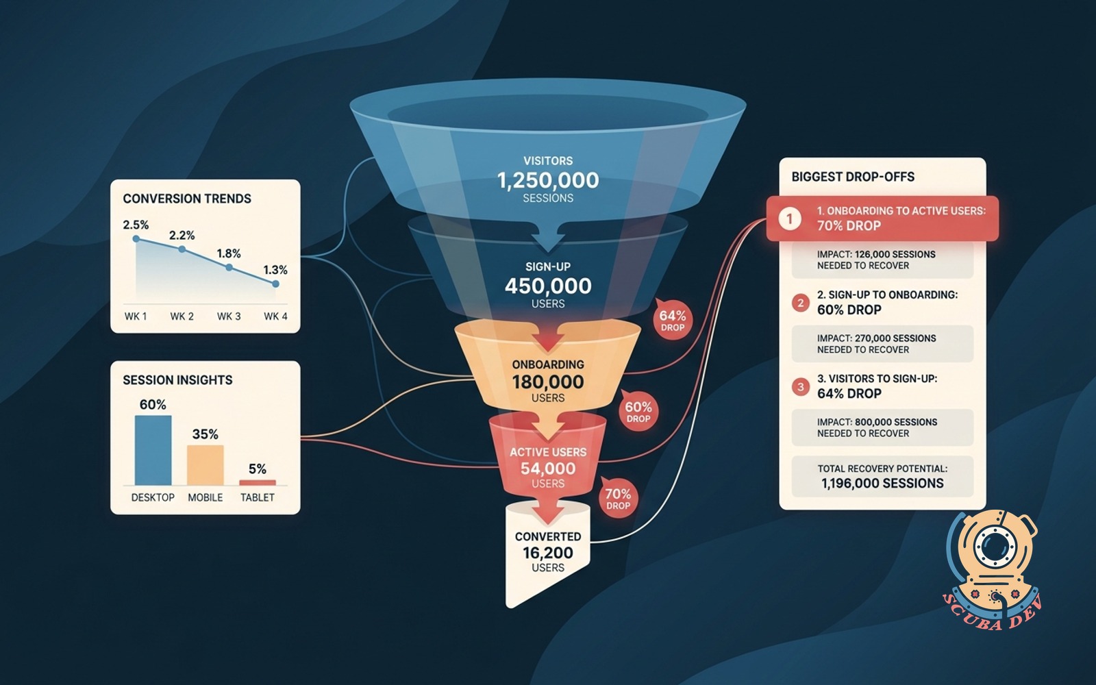
Use this pattern for the lead-time mindset outside engineering: identify the stage where work stalls, quantify the drop, and focus the next improvement cycle there.
Read the full idea: Funnel conversion dashboard with drop points →
-
04 / Attribution blended view
Blends last-touch, first-touch, and linear side by side. Lets leaders argue with data, not opinion.
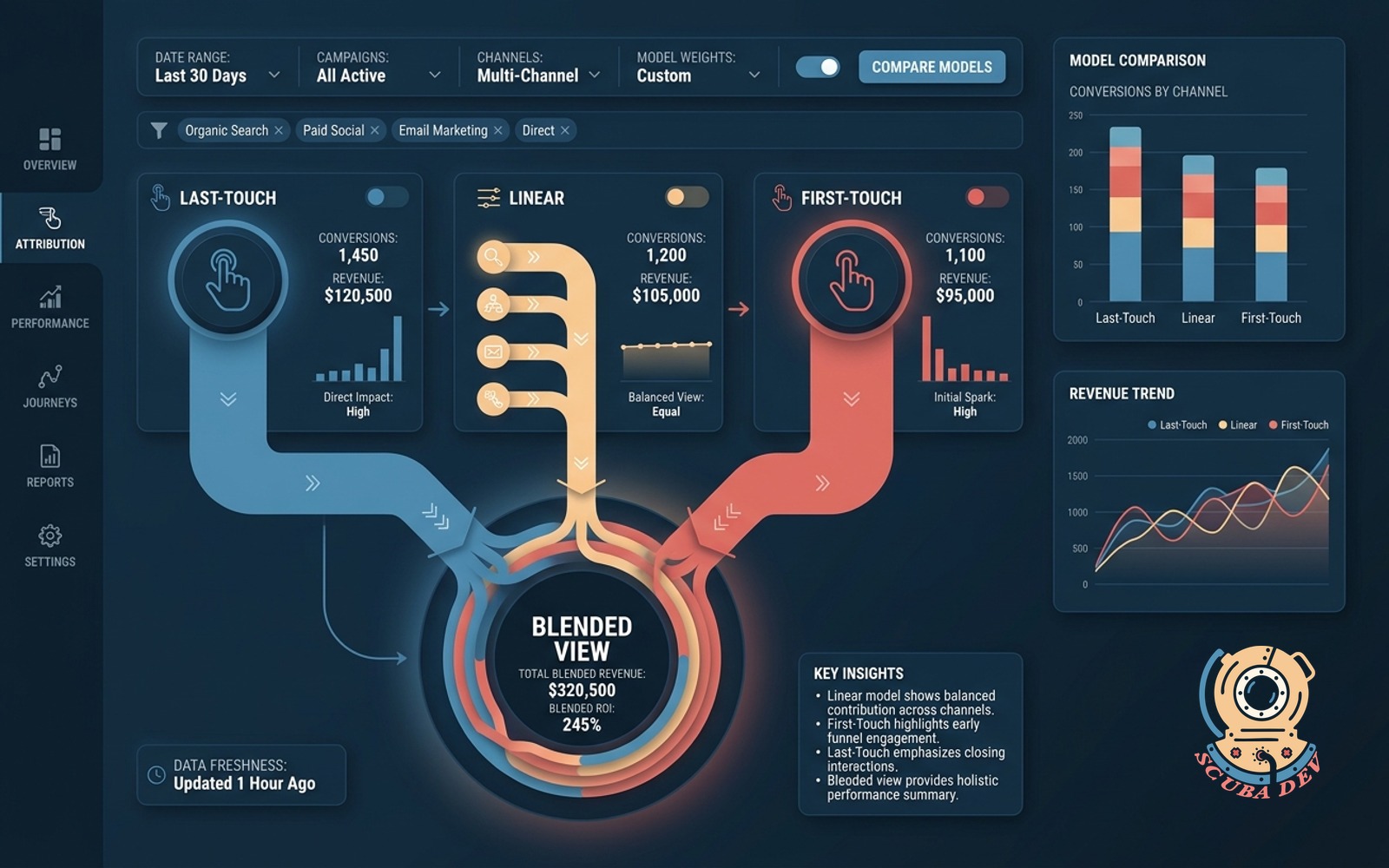
This is the dashboard-shape reference from the source post: keep competing views side by side so leaders debate the signal instead of each other.


What the dashboard needs to show
Keep the first dashboard boring enough to trust. Four cards, trends, recent deploys, and a short narrative will outperform a complex executive portal nobody reads.
- 01
Four live cards
Each metric needs a current thirty-day number, target, and trend. Do not hide the stability metrics below the fold.
- 02
Recent deploy table
Show the last twenty deploys with lead time, incident flag, and recovery time when applicable.
- 03
Weekly narrative
A plain-English summary should name the bottleneck, the service, and the next operating change.
Where teams misread the numbers
Most bad DORA dashboards fail on definitions before they fail on tooling.
- 01
Count production only
Staging, QA, preview, and demo deploys do not count. The customer-facing production environment is the measurement boundary.
- 02
Rollback is a deploy
If you rolled back production, deployment frequency should go up. The failure belongs in change failure rate, not hidden from the deploy count.
- 03
Lead time starts at commit
PR opened, ticket started, and sprint planned are useful signals, but DORA lead time is commit to production.
- 04
Failures are user-facing
A pre-production break that never affects users is not a DORA change failure. Keep that signal separate.
AI speeds the loop, measurement keeps it honest
AI coding tools compress lead time and increase deploy frequency when the team has context files, tests, review gates, and CI agents. Without that system, failure rate can climb as quickly as throughput.
- 01
Measure before optimizing
Baseline the loop first. Then decide whether to attack CI time, approval gates, incident response, or review quality.
- 02
Watch speed and stability together
Lead time gains do not matter if change failure rate spikes. The target is smaller safe changes, not bigger risky batches.
- 03
Put agents inside CI and PRs
The strongest pattern is AI assisting tests, PR review, release notes, and rollback readiness inside the delivery loop.


FAQ
How often should we measure DORA metrics?
A: Keep the dashboard live. Review weekly for the first ninety days, then monthly once the baseline stabilizes.
Do DORA metrics work for mobile or embedded teams?
A: Yes, with release-process caveats. Mobile deployment frequency is capped by app store review cycles, and embedded teams need a clear production definition.
What about SPACE metrics?
A: SPACE adds satisfaction and collaboration dimensions. DORA remains the cleaner operational starting point because it ties activity to production outcomes.
Can a team of three really measure DORA?
A: Yes. The measurement habit is the point. A webhook, Postgres, and a small dashboard are enough to start.
Is deployment frequency a vanity metric?
A: Only if you read it alone. Deployment frequency plus change failure rate tells whether speed is improving or just moving risk faster.
Should AI-generated code count differently?
A: No. A deploy is a deploy. Track whether production changed and whether customers were affected.