
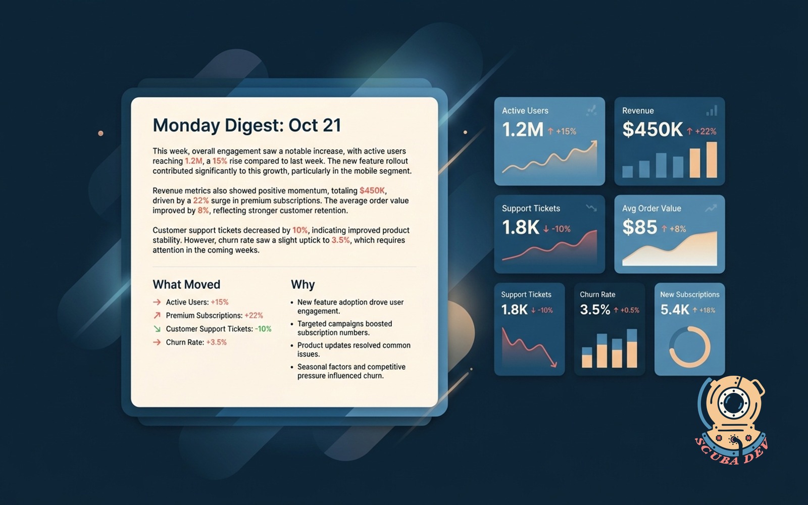
Weekly metrics digest with AI narrative
Key metrics summarized in plain language every Monday. Calls out what moved, what slipped, and why.
Possibilities
Where this could go
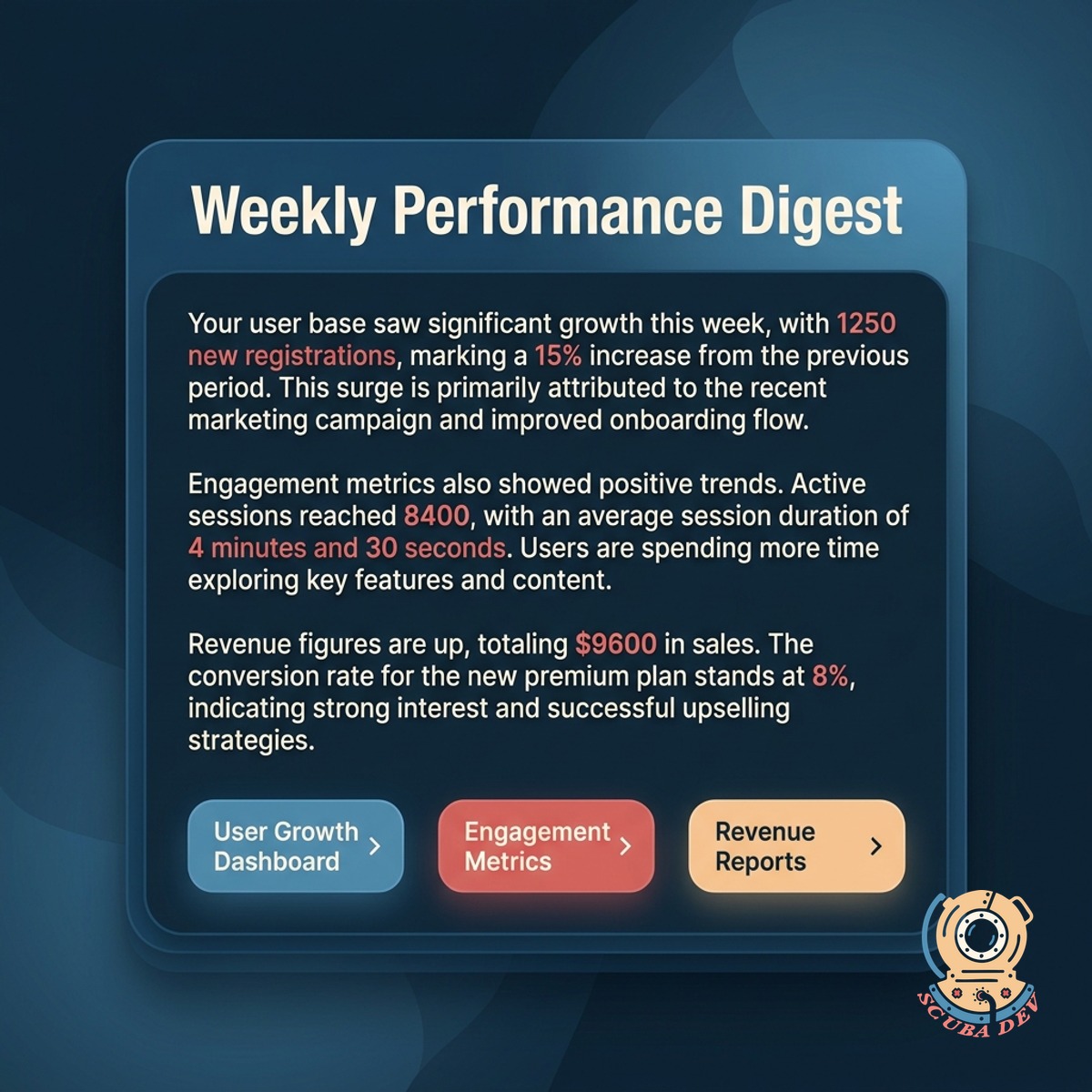
Summary In Plain Language
Your top metrics explained in the same plain language your team uses. No jargon, no dashboards you have to interpret.
- Metrics translated from data to sentences
- Each sentence names the number and the context
- Grouped by category for easy skimming
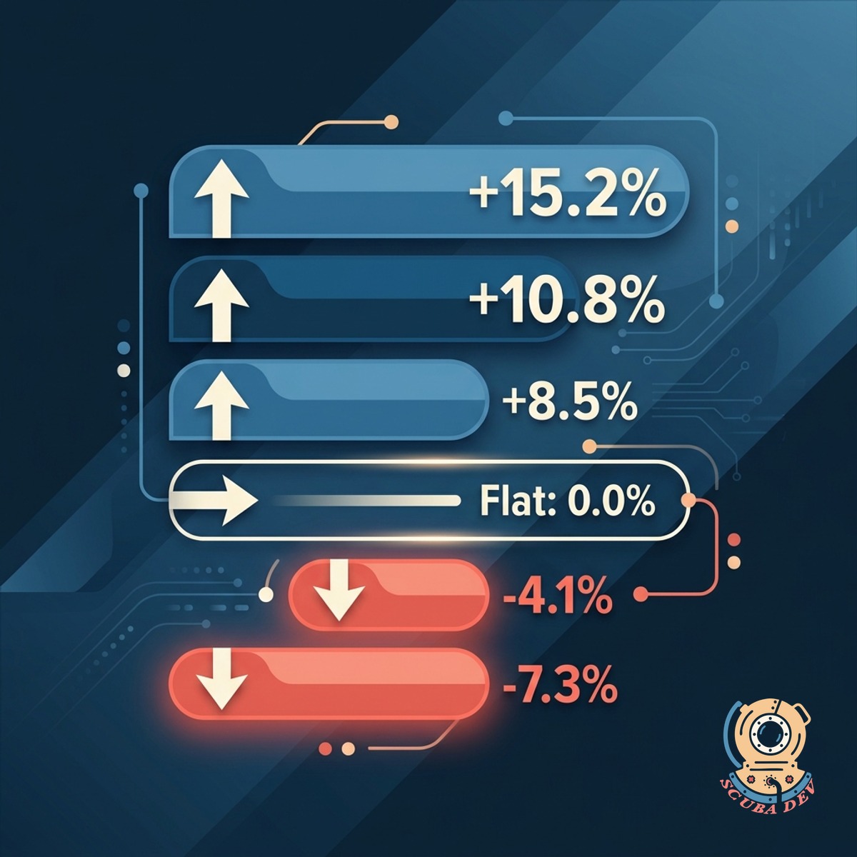
Calls Out The Movers
Not every metric matters every week. The digest surfaces what moved, what stayed flat, and what slipped.
- Biggest movers called out first
- Flat metrics condensed into a single line
- Slipped metrics flagged with a coral chip
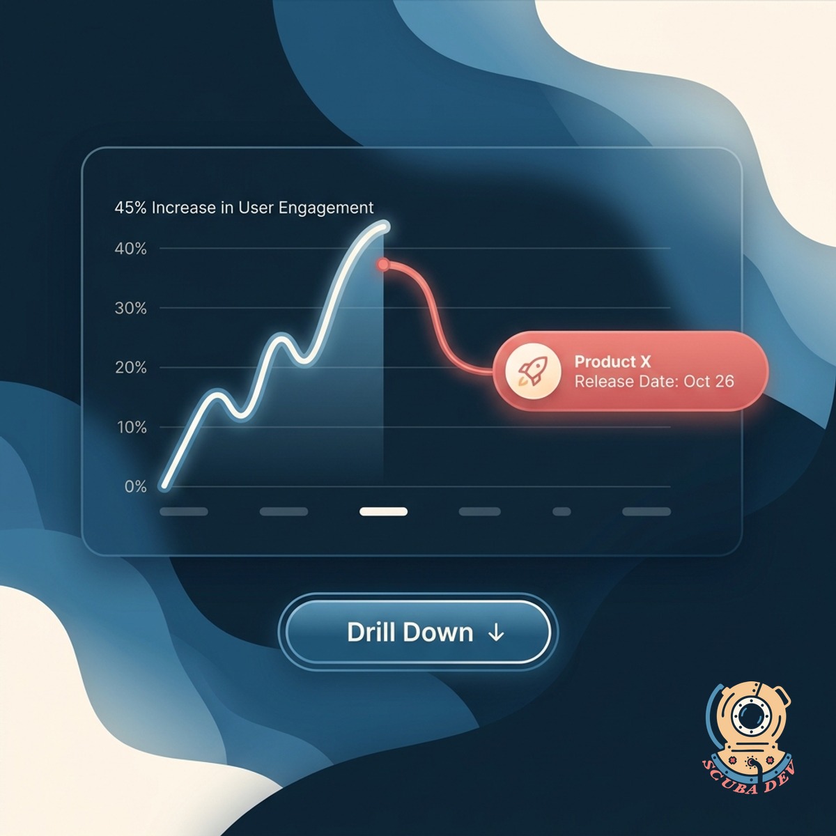
Why It Moved
For every mover, the digest attempts a why. Releases, campaigns, seasonality, and incidents all correlate into the explanation.
- Correlates metric shifts with product releases, campaigns, and incidents
- Seasonality baseline included
- Link to drill into the raw data
Questions
Things people ask
What metrics should go in the digest?
The ones your team actually acts on. Revenue, active users, conversion, churn, cost per acquisition, NPS. We help pick during onboarding and refine over time.
Where does the data come from?
Your data warehouse, your BI tool, Mixpanel, Amplitude, Stripe, Salesforce, HubSpot. We read, we do not move. Your data stays where it lives.
How is the why explanation generated?
We correlate metric movement with events from your release calendar, campaign tracker, and incident log. The digest surfaces the likely correlation and labels it as a hypothesis, not a conclusion.
Can different team members get different digests?
Yes. Marketing gets the acquisition metrics. Product gets the engagement metrics. Finance gets the revenue metrics. One data layer, multiple digests.
How often does it send?
Weekly is the default. Daily mode available for fast-moving teams. You pick the day and time per audience.
Does the digest link back to dashboards?
Yes. Every metric in the digest links to the live dashboard in your BI tool with the right filters applied. Drill in with one click if you want the raw view.
Does this replace our BI tool?
No. It sits on top of it. Looker, Metabase, Mode, Tableau, and Power BI still own the deep analysis. We handle the weekly translation into plain language.