
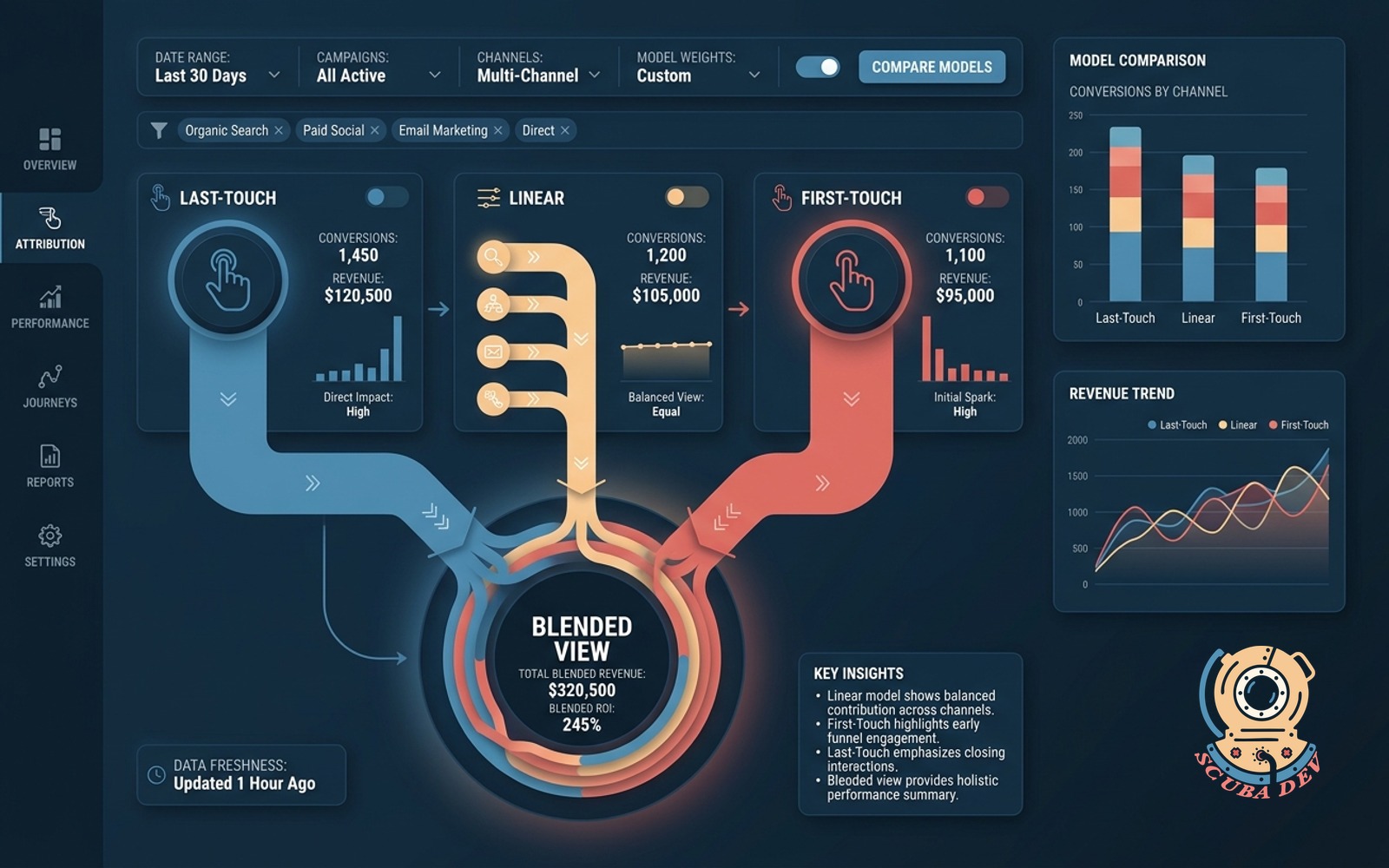
Attribution blended view
Blends last-touch, first-touch, and linear side by side. Lets leaders argue with data, not opinion.
Possibilities
Where this could go
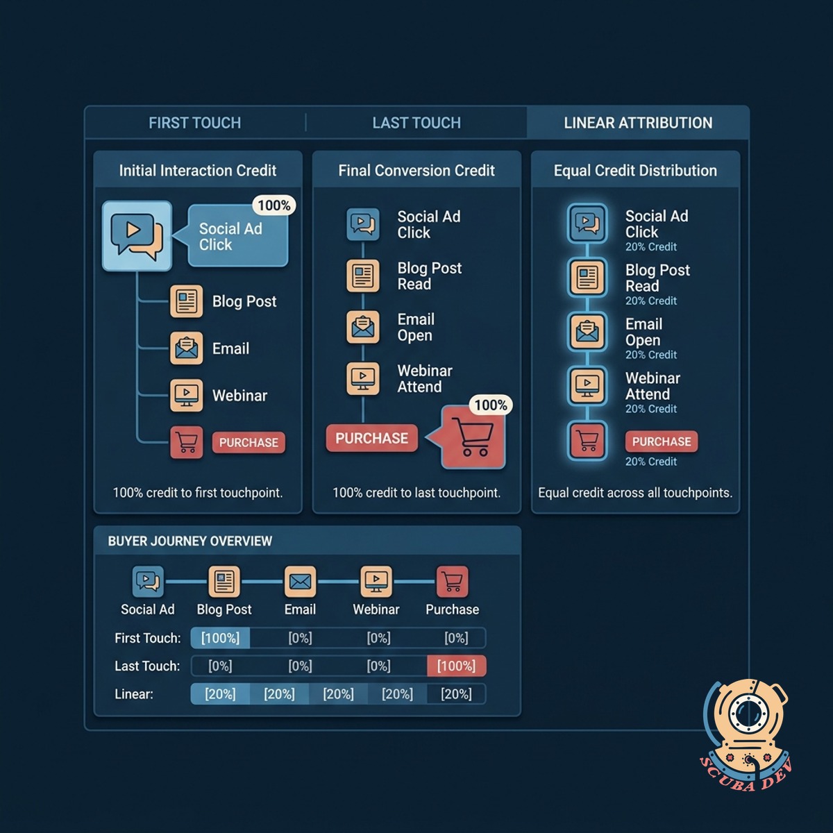
Compare Three Attribution Models Instantly
View first touch, last touch, and linear attribution models next to each other to see the complete buyer journey.
- View models side by side
- Compare campaign impact
- Spot hidden touchpoints
- Reduce reporting bias
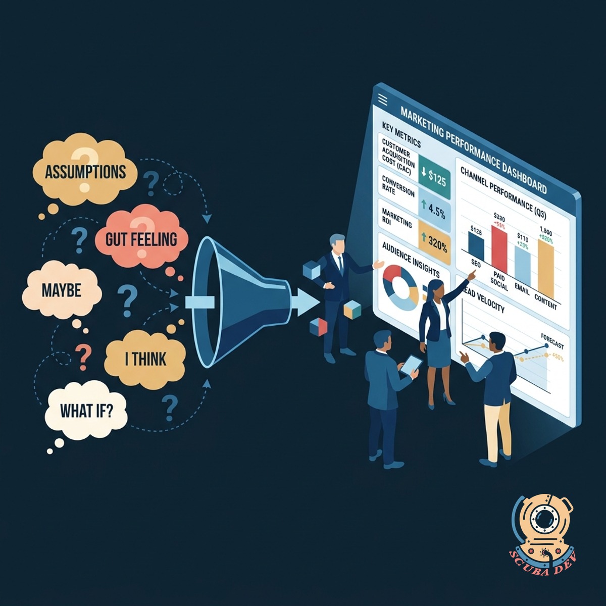
Replace Opinions With Hard Marketing Data
Give your executive team the exact numbers they need to debate strategy using facts instead of assumptions.
- End subjective debates
- Show the full picture
- Align sales and marketing
- Build executive trust
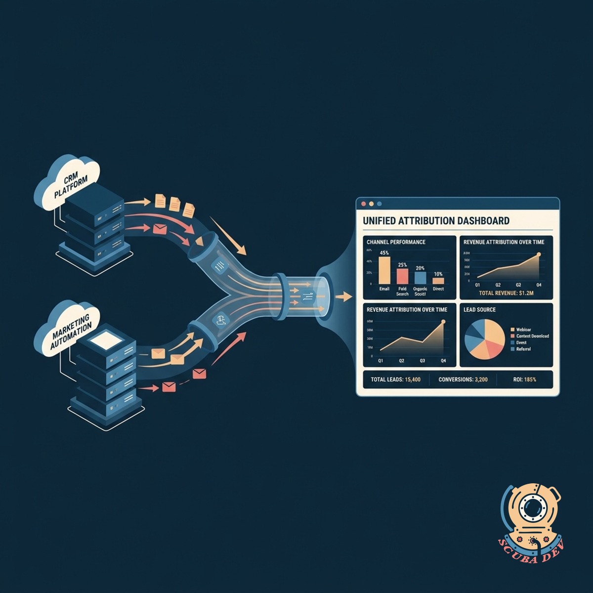
Pull Data From Your Existing Stack
Connect your current CRM and marketing automation platforms to generate a unified attribution dashboard.
- Connect Salesforce data
- Pull from HubSpot
- Sync Marketo campaigns
- Aggregate Google Analytics
Questions
Things people ask
How does the blended view actually work?
The tool pulls your conversion data and applies three different mathematical models simultaneously. It then displays the results for first touch, last touch, and linear attribution in parallel columns. This lets you see exactly how credit shifts depending on the model you choose.
Which marketing platforms do you support?
We integrate directly with major platforms like Salesforce, HubSpot, Marketo, and Google Analytics. The system extracts the raw touchpoint data from these sources to build the blended models. Custom API connections are also available for proprietary systems.
Will this slow down our current reporting tools?
Not at all. The blended view operates as a standalone visualization layer that queries your data warehouse or CRM via API. It does not interfere with your native reporting speeds or daily operations.
Do we need a data scientist to set this up?
You do not need a data scientist. Our team handles the initial data mapping and integration during the setup phase. Once connected, the dashboard automatically updates and is ready for your marketing leaders to use.
Can we customize the timeframes for the attribution models?
Yes. You can adjust the lookback window to match your typical sales cycle. Whether your buyers take two weeks or six months to convert, the models will calculate touchpoints within your specified timeframe.
How does this help resolve executive disagreements?
Different leaders often favor different metrics based on their department goals. By showing all three models side by side, everyone sees how top of funnel efforts and closing actions contribute to the final sale. It forces the conversation to center on complete data rather than isolated metrics.
Can we export the blended data for our own presentations?
You can export the side by side comparisons as CSV files or high resolution images. This makes it simple to drop the exact charts into your quarterly business review decks. Scheduled email reports are also available for weekly updates.