
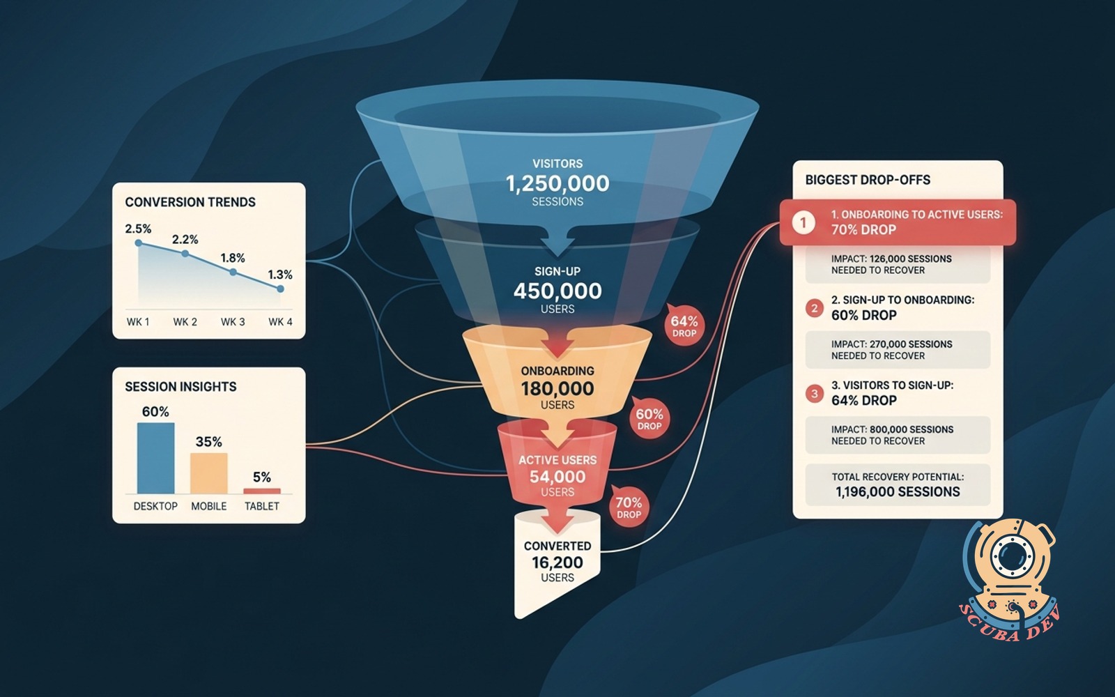
Funnel conversion dashboard with drop points
Shows the conversion step by step. Ranks the biggest drop-offs with the session count you would need to move.
Possibilities
Where this could go
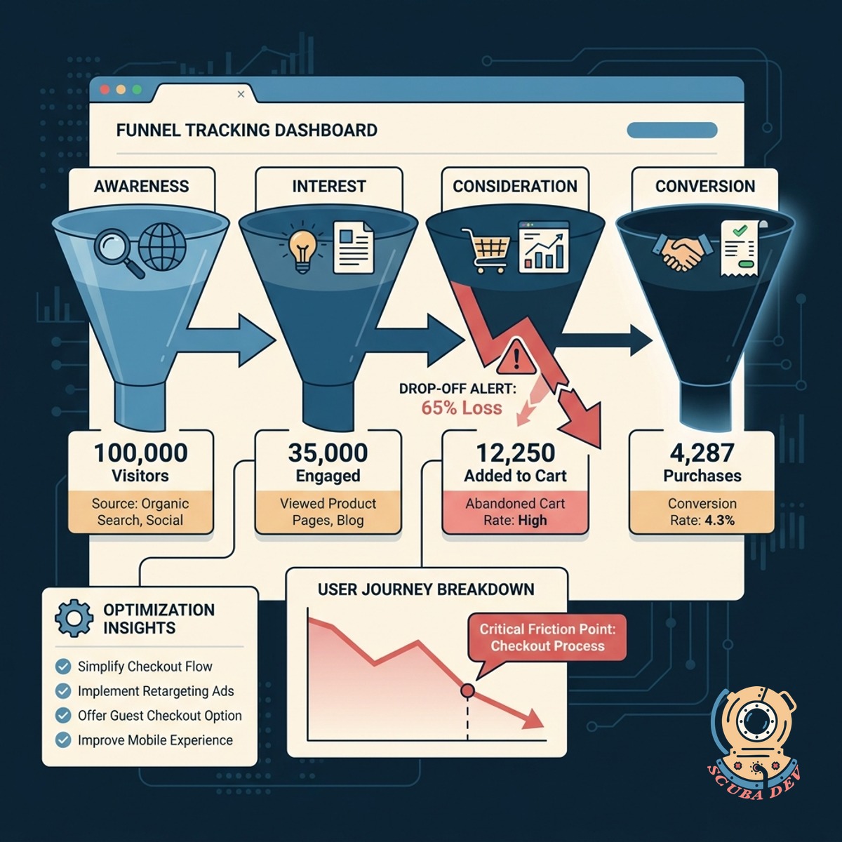
Visual Step By Step Funnel Tracking
See exactly how users move through your website stages to identify where the journey breaks.
- Connects to Google Analytics 4
- Maps custom user journeys
- Displays absolute session counts
- Updates data automatically
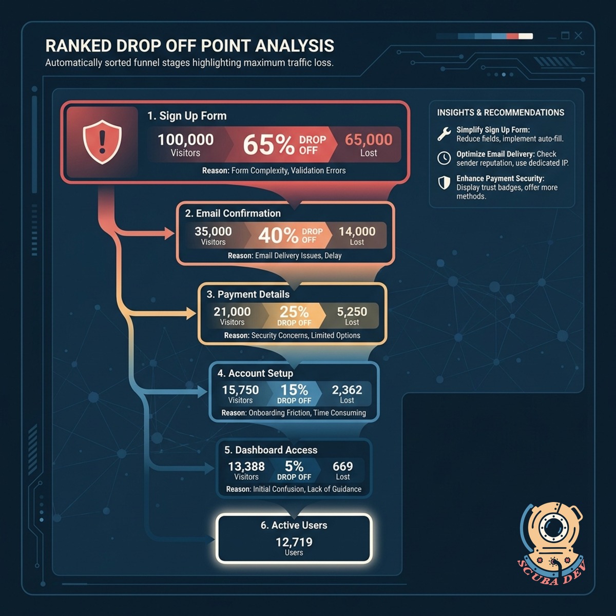
Ranked Drop Off Point Analysis
The dashboard automatically sorts your funnel stages to highlight the exact steps losing the most traffic.
- Ranks highest abandonment rates
- Highlights critical friction points
- Compares steps side by side
- Filters by device type
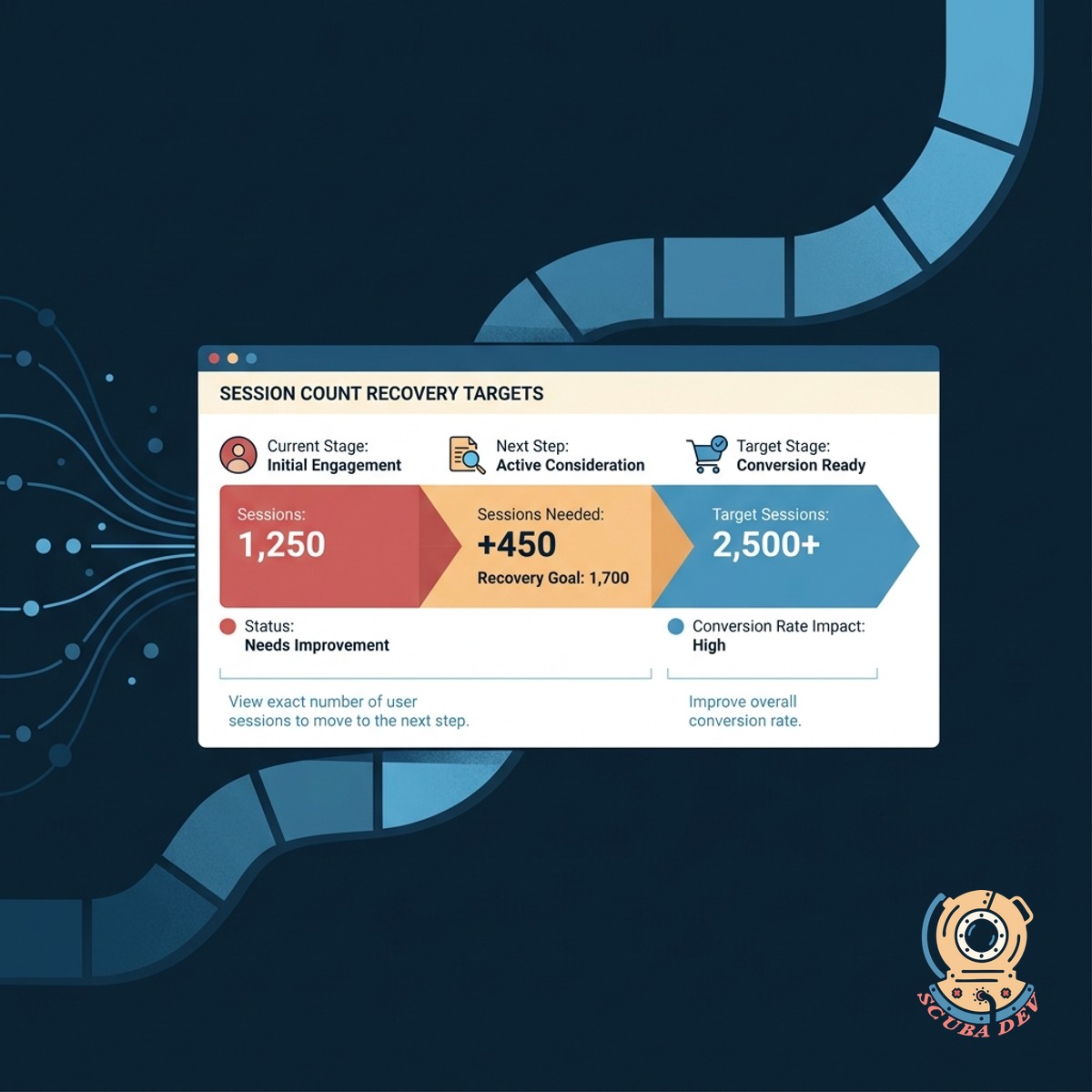
Session Count Recovery Targets
View the exact number of user sessions you need to move to the next step to improve the overall conversion rate.
- Calculates required session volume
- Sets clear optimization targets
- Integrates with Mixpanel data
- Tracks progress over time
Questions
Things people ask
What data sources can this dashboard connect to?
We typically build these dashboards using data from Google Analytics 4, Mixpanel, or custom databases. The tool pulls your raw event data to construct the funnel steps accurately.
Can we track multiple different conversion funnels?
Yes. The dashboard can support multiple distinct pathways, such as a checkout flow, a newsletter signup, or an account creation process. You can switch between these views using a simple dropdown menu.
How does the tool calculate the session count needed to move?
The dashboard looks at your current conversion rate between two specific steps and compares it to a baseline or target rate. It then outputs the exact number of additional sessions required to bridge that gap.
Is the funnel data displayed in real time?
Data freshness depends on your underlying analytics provider. Most setups update daily or hourly, which provides enough accuracy to identify structural drop points without overloading your data warehouse.
Can we filter the funnel by user segments?
The dashboard includes standard filtering options like device category, traffic source, and geographic location. This allows you to see if a specific drop point is isolated to mobile users or a particular marketing campaign.
Do we need an existing data warehouse to use this?
A dedicated data warehouse like BigQuery is helpful but not strictly required. We can often connect visualization tools directly to your analytics platform API to generate the drop point rankings.
How do we define the steps in the funnel?
We work with you to map out the critical pages or events that make up your ideal user journey. These steps are then hardcoded into the dashboard logic to ensure consistent tracking over time.